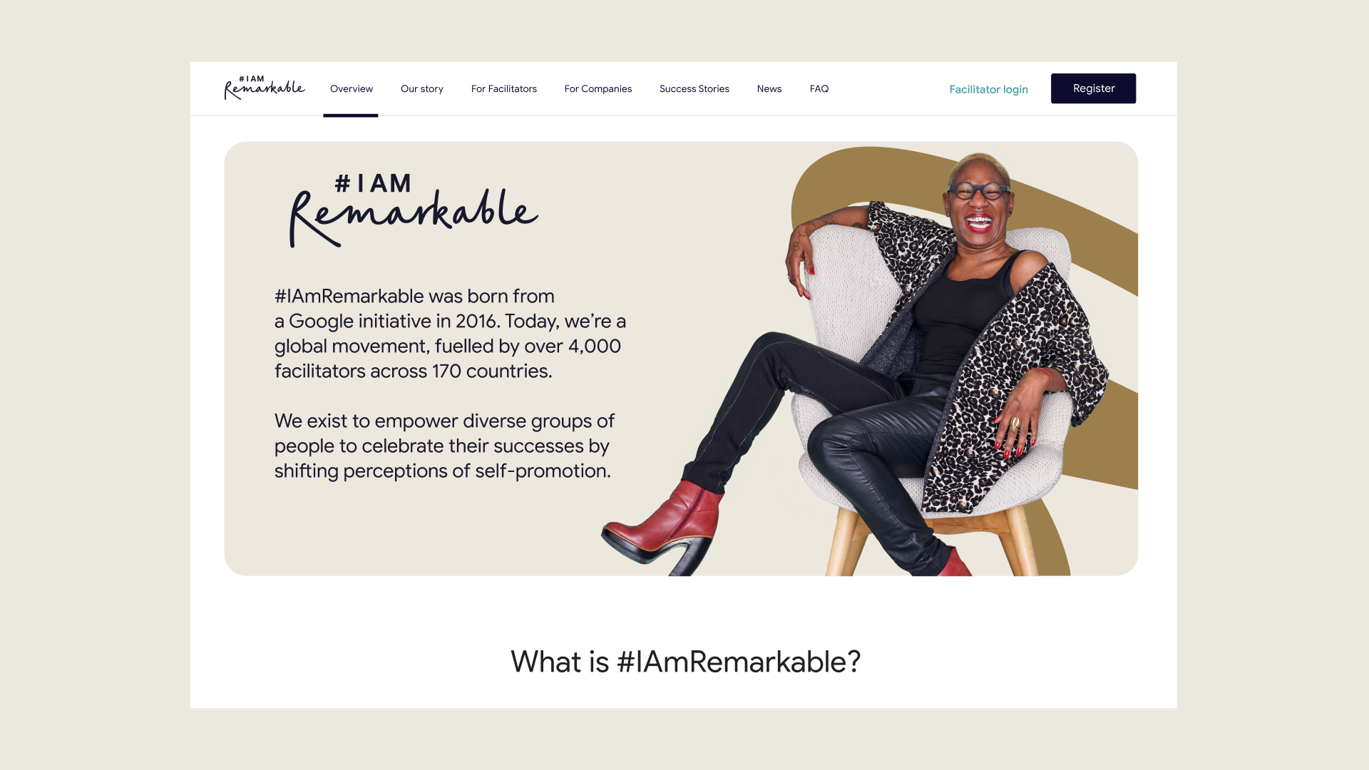
ABOUT
Cast your mind back to 2016. It might feel like an age ago, but even then we were doing what we do best. In fact, we were busy cooking up a slick brand identity for the brainchild of Google’s Anna Vainer, #IAmRemarkable. Nobody knew then where it would lead, but their mission was clear: to empower everyone to celebrate their achievements in the workplace and beyond, while also challenging social perceptions around self-promotion.
Today, their 90-minute workshops have been delivered to over 450,000 participants across 178 countries. With 4,000 active facilitators across 1,000 organisations, #IAmRemarkable is truly a community-led brand. To ensure longevity, we worked closely with the team to extend the brand for 2023 and beyond.
Empowering the whole #IAmRemarkable community
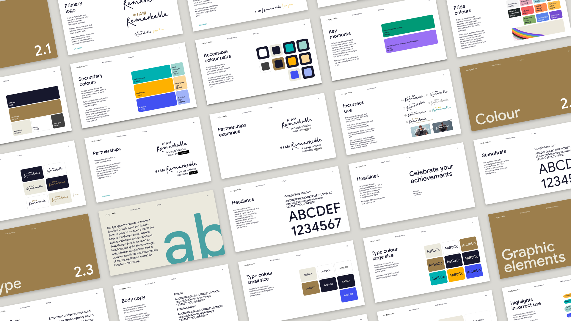
With the facilitator-led workshops being such a driver of #IAmRemarkable’s success, we were conscious that the new brand guidelines had to be simple enough to be used by every member of the community.
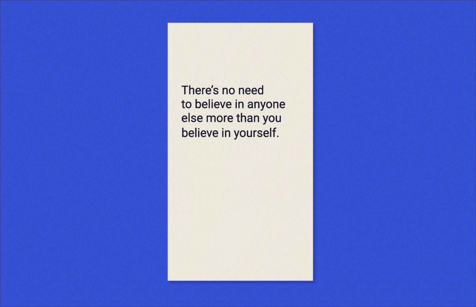
To help with this, our copy team worked to develop clear, snappy articulations of key principles and selling points. Rather than creating an inflexible tone of voice guide, we produced five tone of voice principles to guide future writing: open to all, bold never braggy, results driven, radically authentic and grounded gratitude. These offer enough of a guardrail to ensure the brand remains consistent without restricting future growth.
A colourful visual identity
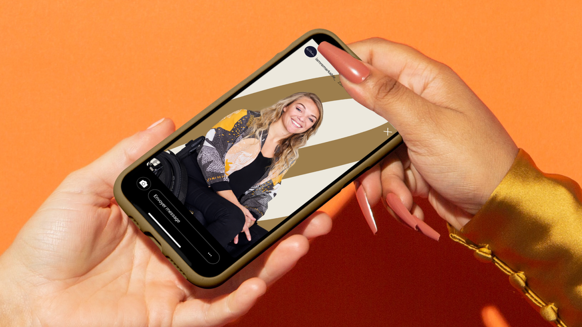
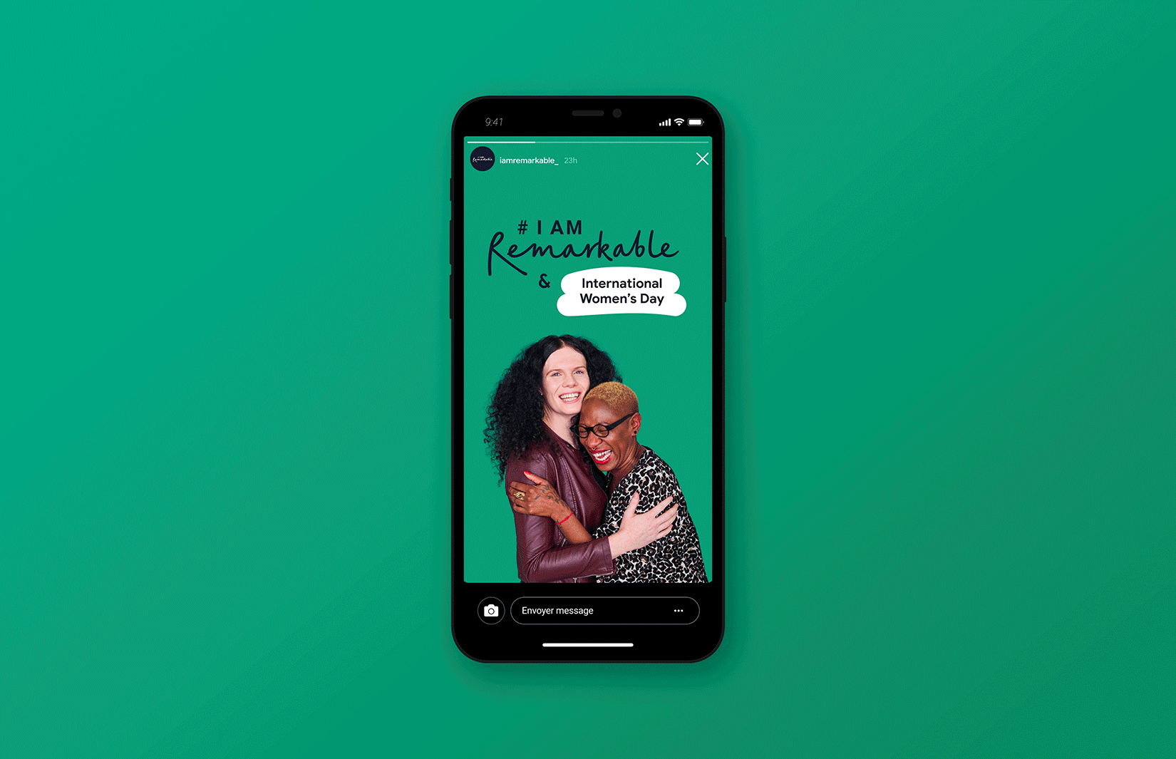
Working with the existing colour palette, our design team gave careful thought to how the core #IAmRemarkable brand could flex to spotlight key dates, such as International Women’s Day, Black History Month, and Pride. To do this, we developed an ever-evolving design language that gives key diversity moments a single signature colour, allowing them to feel like colourful mini-brand takeovers.
Highlighting what’s really important
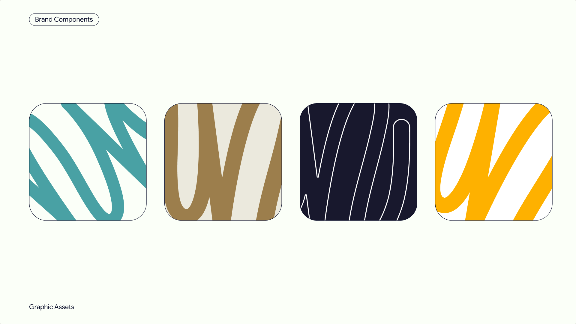
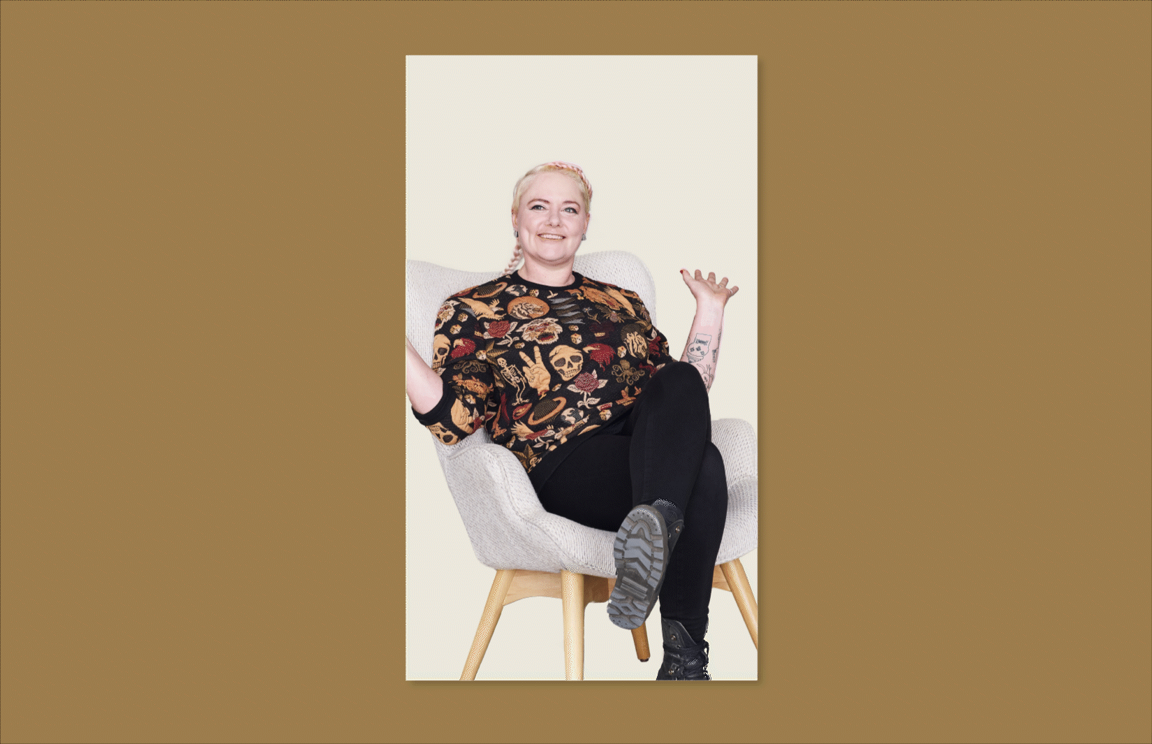
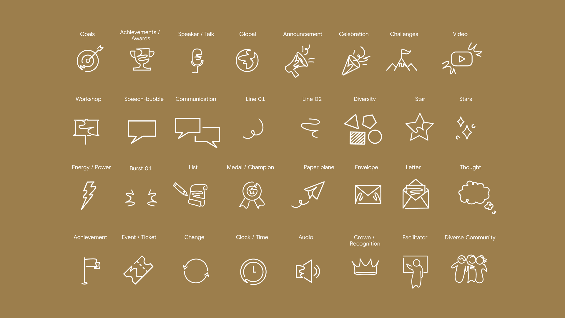
To visually represent #IAmRemarkable’s mission to highlight untold stories, we also developed a brand new graphic element using bright sweeps of colour to indicate key messages. Along with charming, free-hand doodle elements, these highlights add touches of lightheartedness and fun into the brand’s visual identity.
Building on the hand drawn doodle elements, we also created a library of doodle icons – including lighting bolts, event tickets, and symbols for familiar celebrations and challenges.
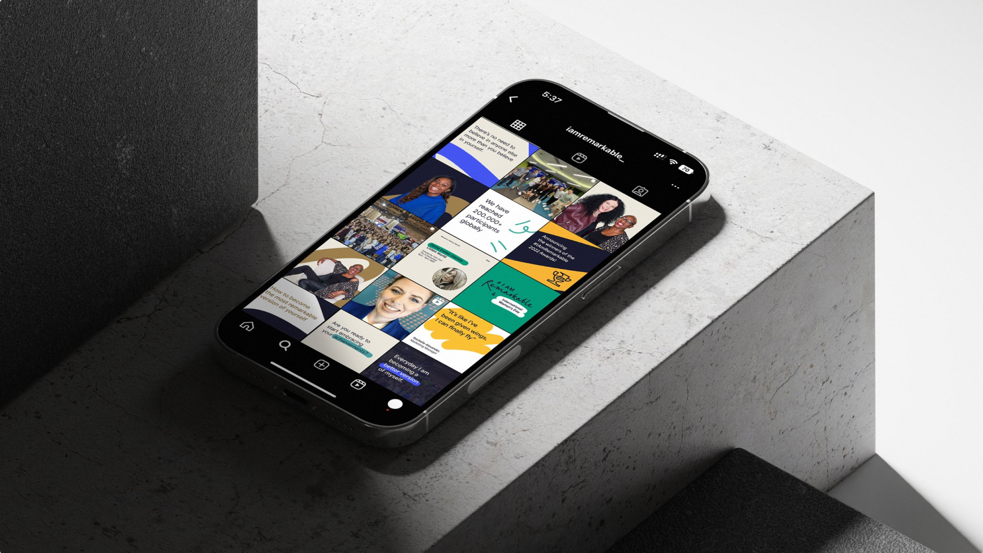
Finally, we updated the photography guidelines to keep members of the #IAmRemarkable community from around the world front and centre. To bring all these elements together, we built best practice examples of the brand applied to web, print, social media, events, and even marketing collateral such as stickers and door hangers.
Our work in the wild
Ultimately, we not only executed the brand extension, but handed over a comprehensive how-to guide, which can be used by anyone working with #IAmRemarkable. The extended brand was showcased during SheSay’s International Women’s Day 2023 Spring Forward Festival and is now live around the world.
To celebrate Google’s 25th birthday, we designed a campaign built around anticipation and reward, revealing products gradually to create a sense of momentum across multiple touchpoints.
The experience extended into an interactive QR-led activation, where users unlocked a digital piñata in their own space, adding a layer of surprise and delight beyond the storefront. From visual identity to campaign assets and interactions, every touchpoint was designed to feel cohesive, engaging, and distinctly Google.
Google’s partnerships with football clubs across the UK and Germany created the need for a giveaway initiative designed to reward loyal customers with access to exclusive experiences. Originally scoped as a lightweight one-page platform, the project quickly expanded beyond its initial expectations as the partnership programme scaled across multiple clubs, markets, and experience types, eventually extending into the US.
Over the past two years, I have worked from the initial product ideation all the way to the evolved UI/UX direction that transformed the platform from a campaign microsite into a scalable experience ecosystem, all centred around the visual language of a ticket.
My idea was to build a flexible design system that could support future expansion while maintaining consistency across markets, content types, and devices. The ticket became the core interaction and branding framework, allowing the platform to adapt seamlessly across football matches, stadium tours, merchandise drops, VIP experiences, and promotional campaigns.
A key challenge was designing a system flexible enough to handle varying content structures, localisation requirements, and edge cases, including long-form German copy and differing event metadata across regions, without compromising clarity or usability.
Alongside leading the UI and UX design across desktop and mobile, I worked closely with developers and QA teams to ensure the final experience translated consistently into production, with particular attention given to interaction details, motion behaviour, and overall interface polish.
The result is a scalable digital platform built to support an evolving range of fan experiences while balancing flexibility, consistency, and ease of use across an increasingly complex ecosystem.