ABOUT
Google’s Shopping is a specialised search service and digital marketplace that allows people to discover, compare, and buy physical products from various online retailers. In 2023, we partnered to create a refreshed digital design identity, shaped around movement, storytelling, and the power of connection.
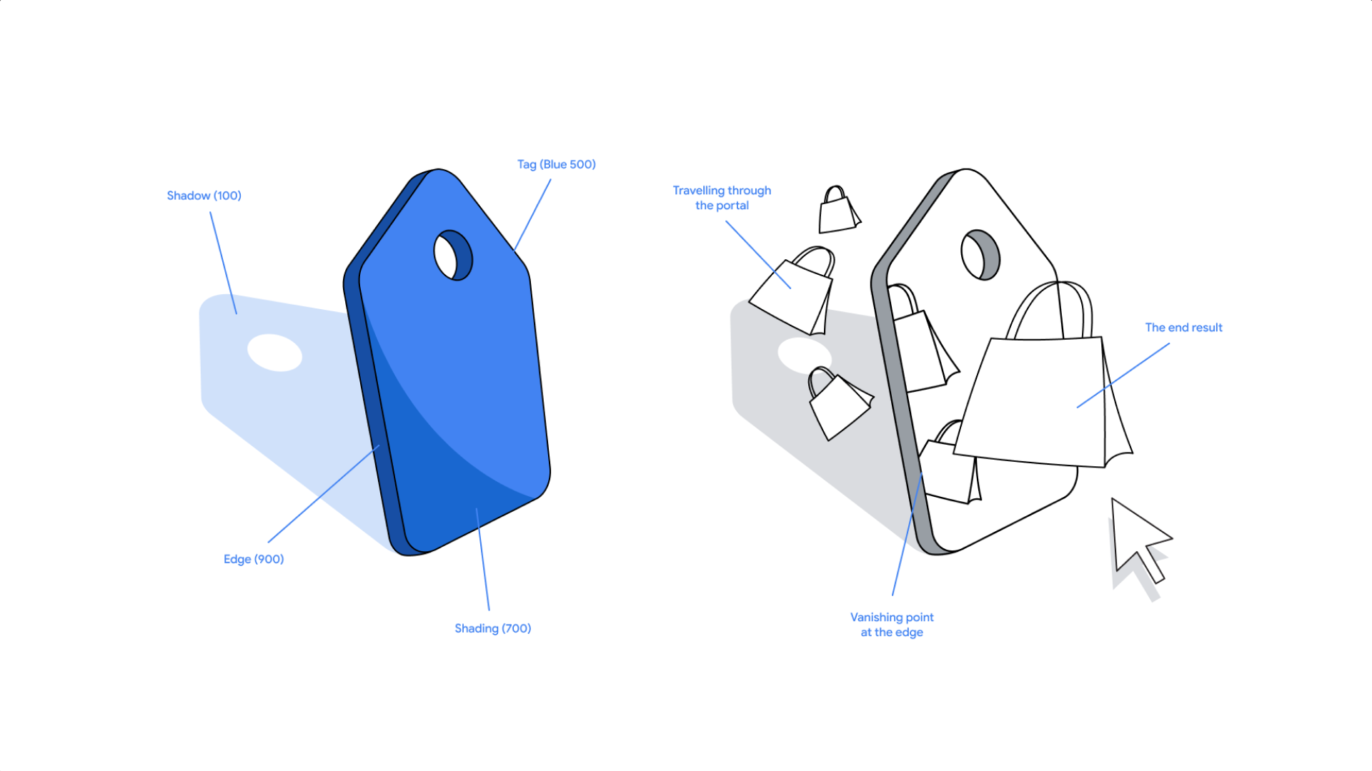
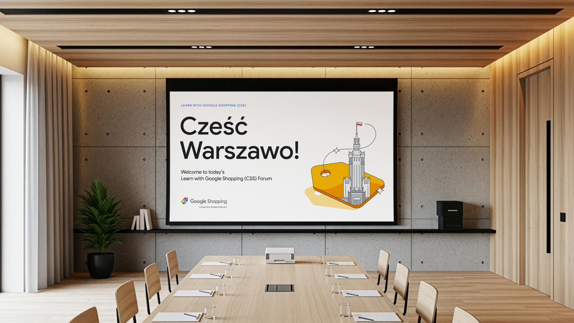
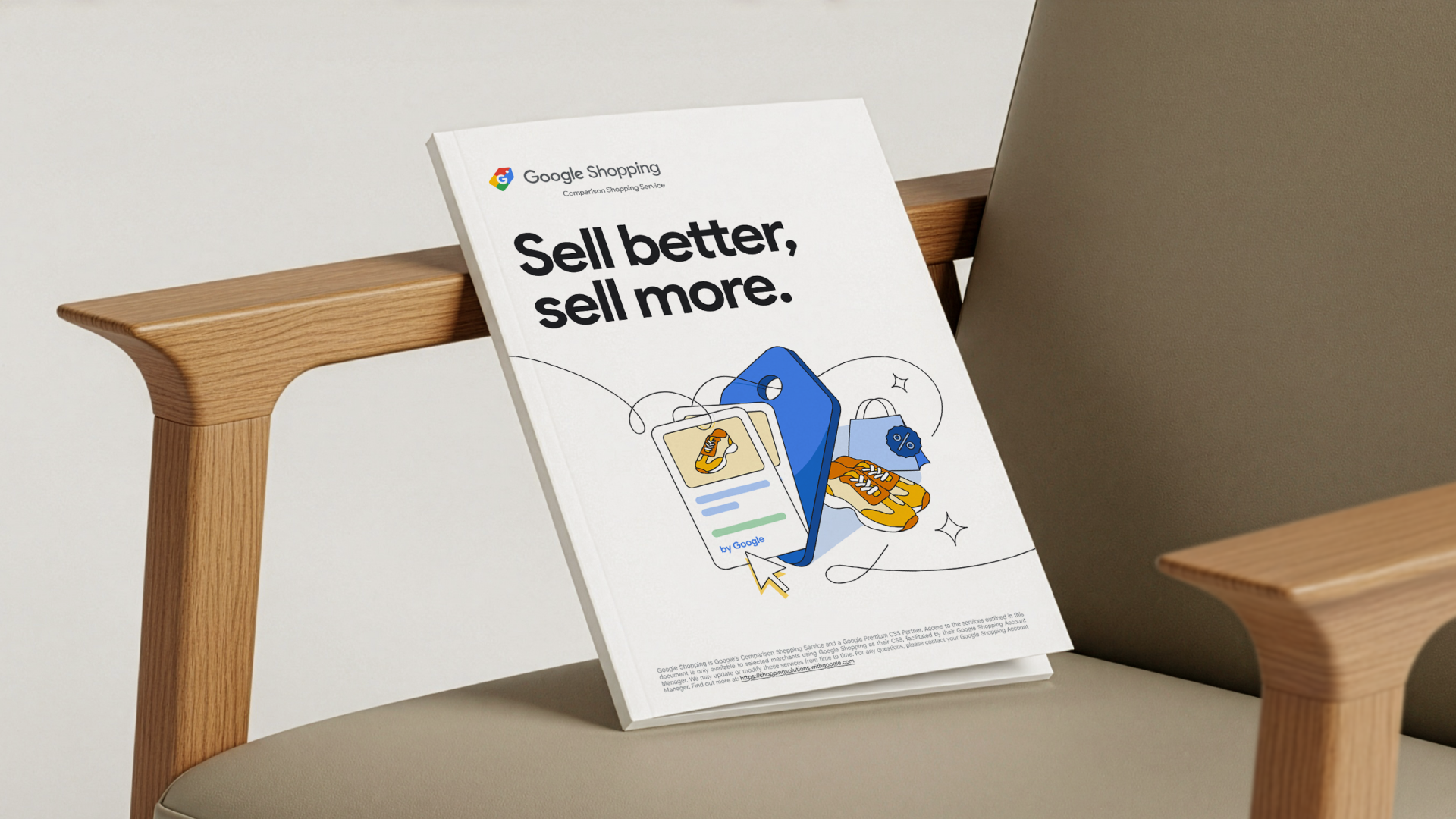
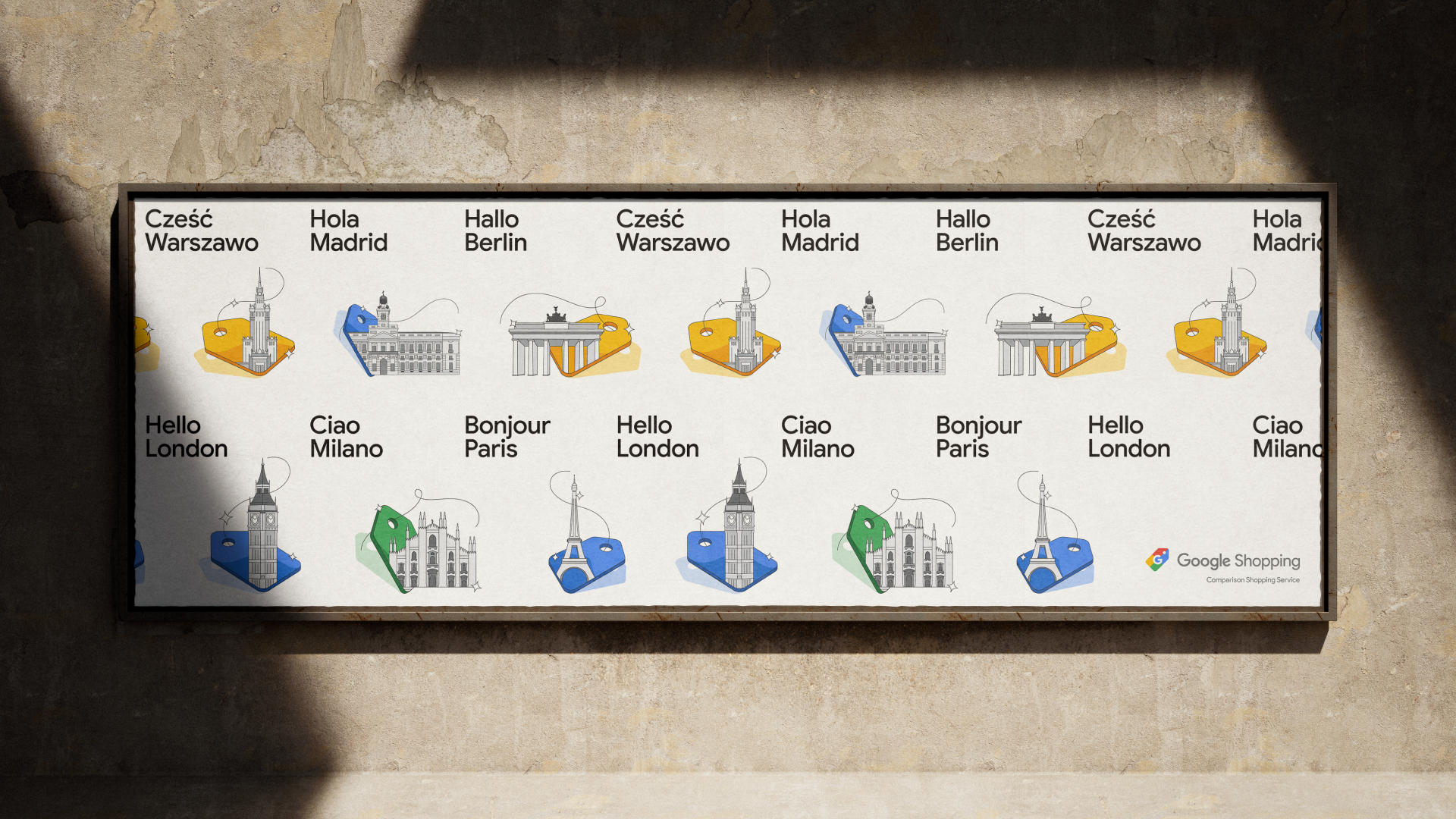
Taking inspiration from the existing Google Shopping logo, we built the entire system around a dynamic shopping tag. As well as being the primary visual element, the tag acted as a creative portal through which we could explore various elements of digital sales, while always keeping Google Shopping at the centre. These secondary 3D elements move playfully through the tag, representing Google’s role at the heart of the e-commerce journey.
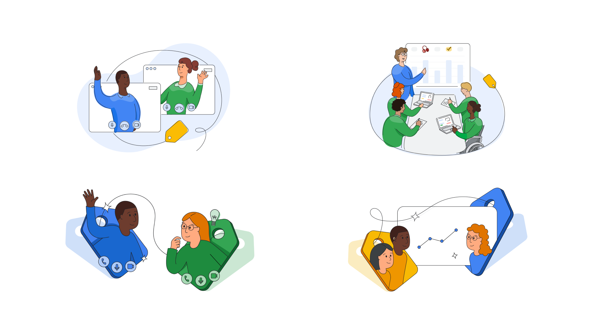
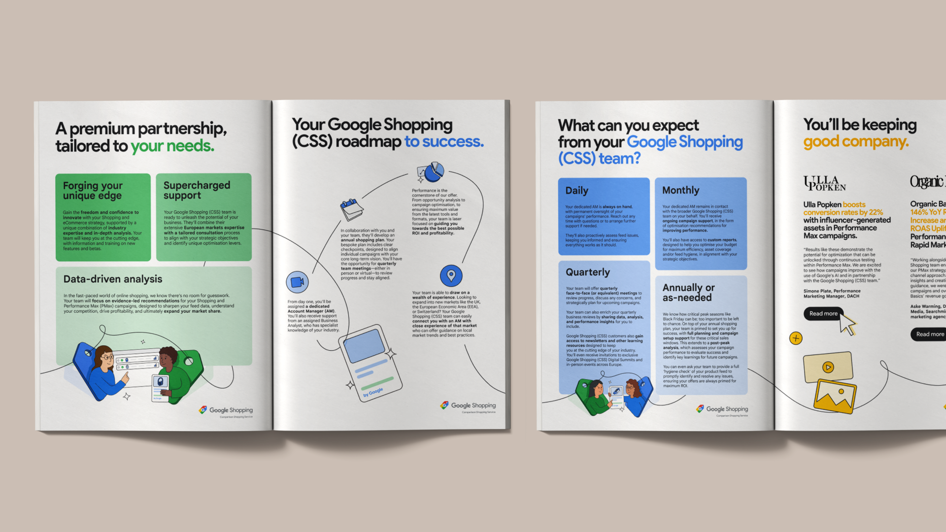
To cement a friendly nature, we added charming human representatives to signify events. A colour system, with Google experts in blue and customers in yellow, offers immediate visual clarity; while experts are positioned higher up on the tag to represent how they are imparting knowledge to the customer.
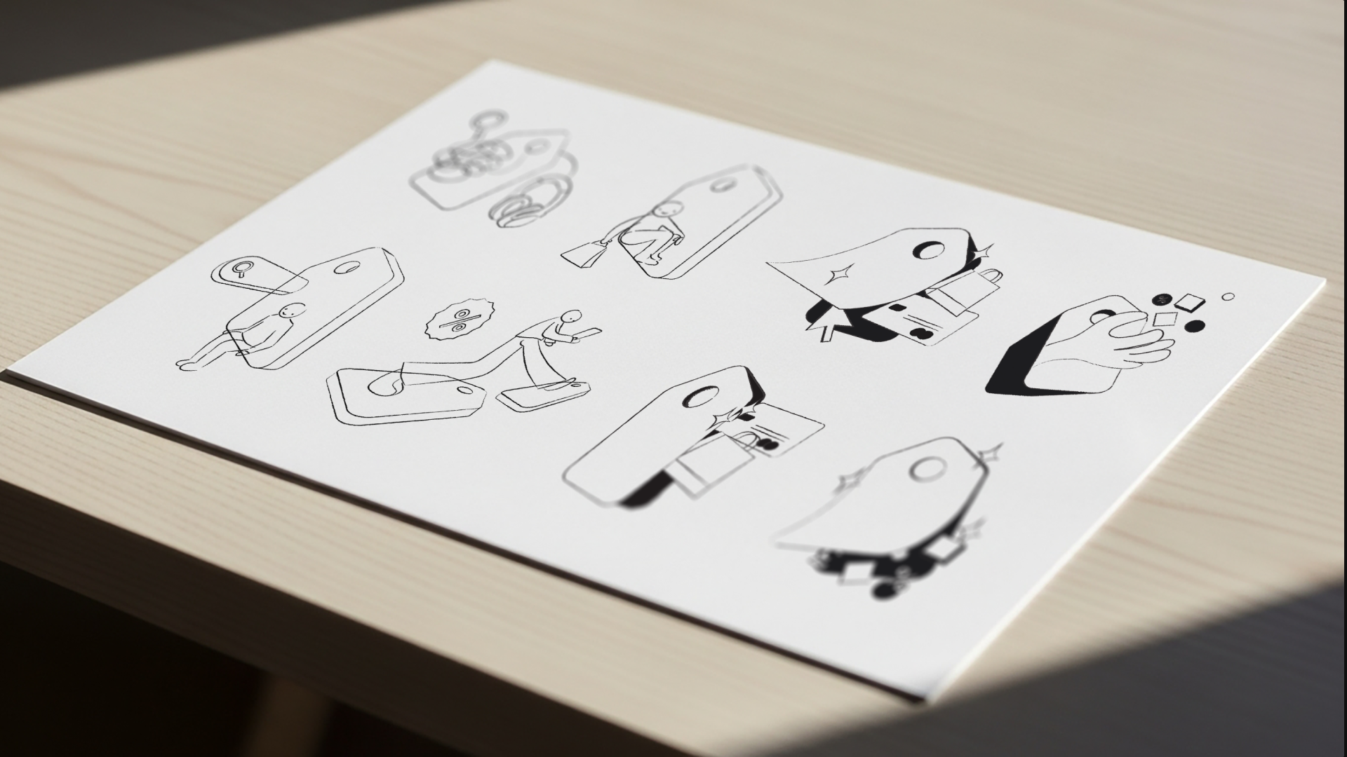
This was a very collaborative process, which I lead, along with another mid-level designer. We used the existing brand world as the foundation of this redesign, but injecting more energy and “magic” into it, as well as a refreshed illustration style, that would make the brand feel contemporary, and future-proof. The collaborative approach we took allowed us to bounce ideas off of each other, push the boundaries of the brief, and our illustrations to achieve the final result.
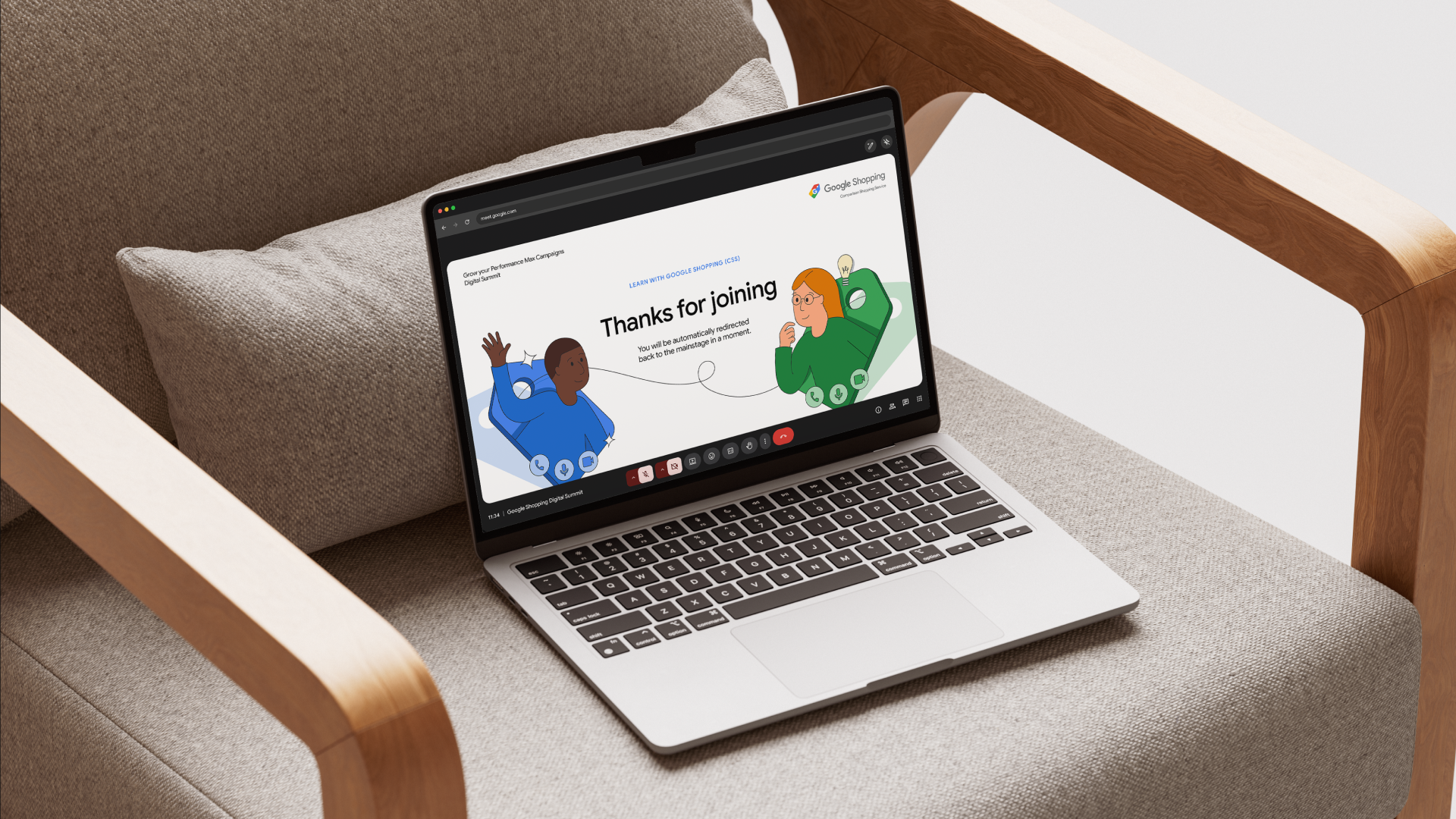
Used across web, events and learning platforms, the brand communicates a wide-ranging service offer, while also bringing Google’s human and helpful values to life in the often overwhelming world of online sales.
This year, I was leading the work on an extension of this brief. I put our system to work for the new Google Shopping ‘Menu of Services’. To increase leads from partner sellers, I refreshed every aspect of the delivery pack, focusing on creating highly digestible, persuasive content. Again, I used colour to strategically highlight roles and areas of focus: blue for Google experts, green for recipients, and yellow for success outcomes. I also extended elements of the original system, using the tag’s thread to guide the eye across each page and gently nudge sellers through the materials – giving them a roadmap for success.